Summary
I’ve been very involved in practising my programming skills in python and sql lately on codewars.
I figured it would be a good idea to visualise my codewars progression.
I’m utilising the codewars public API to pull out my information. The user data is processed in Python with the output being consolidated into a Excel dashboard using Xlsxwriter.
Link to github project: https://github.com/Filpill/codewars-stats
Analytics Process Flow
graph TD;
subgraph Process Initiation
0([Python Notebook Executed])-->A[HTTPS Request Codewars
Username Stats] end subgraph Return JSON A-->C[Username Profile
Data] A-->D[List of Compeleted
Kata by User] A-->E[Individual Challenge
Details] end subgraph Merge Data D-->F[Merge Data via the Kata ID] E-->F F-->G[Re-name Columns to Better Format] end subgraph Count Aggregates G-->H[Categories] G-->I[Monthly Completions] G-->J[Kata Rank] G-->K[Languages] end subgraph Visualisation H-->L[Graphing Cats.] I-->M[Graphing Comp.] J-->N[Graphing Rank.] K-->O[Graphing Lang.] end C-->P subgraph XlsxDashboard L-->P[Insert and Format Tabular Data] M-->P N-->P O-->P P-->Q[Insert Matplotlib Charts] Q-->R([Close Xlsxwriter Workbook Object]) end
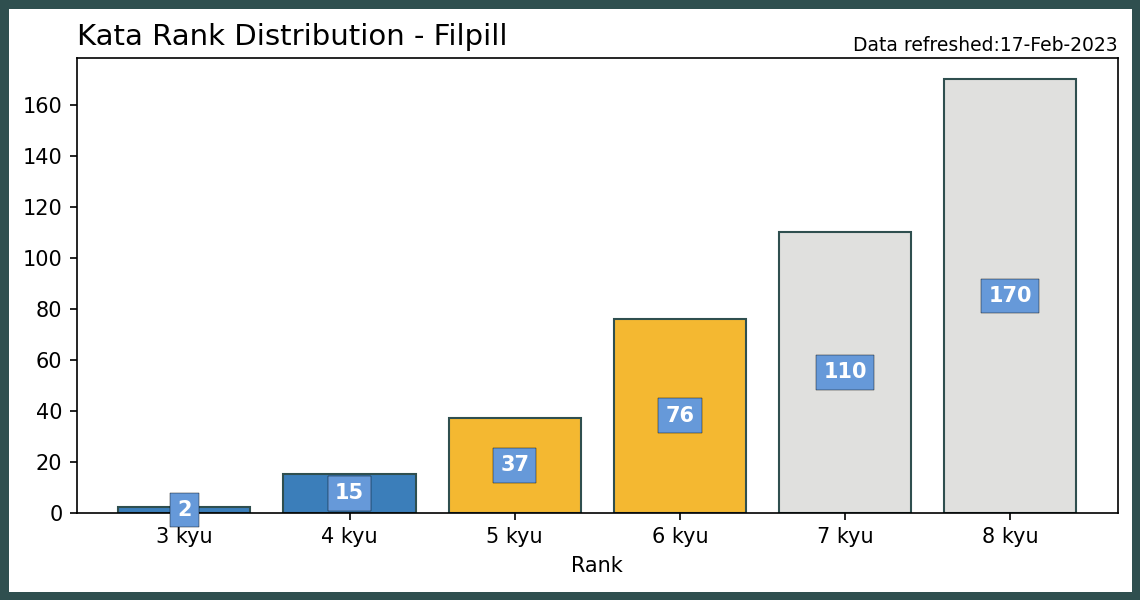
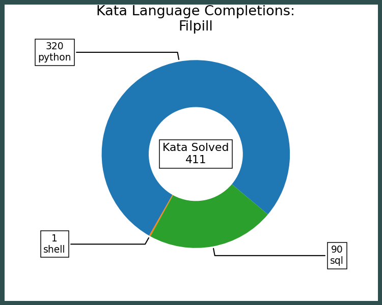
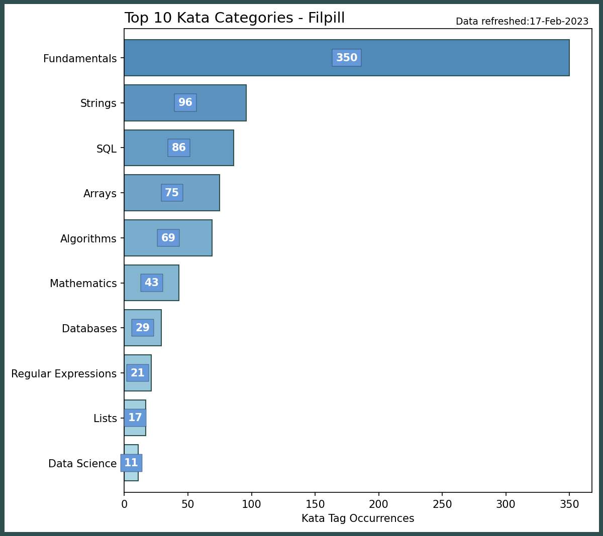
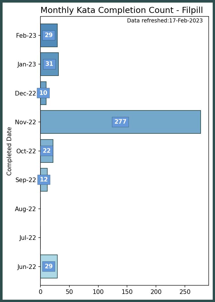
Data Visualisations
These images are served directly from my github repository:

|

|
|---|

|

|
|---|
