🗺️ Summary
This article will quickly show you the process of obtaining airspace data using the OpenSky REST API and how I was able to visualise on a map. I will focus on North American airspace as it seems this region captures the highest volume of aircraft.
The Flight Tracking GitHub Project link is here should you wish to examine my scripts and get some context for the commentary in this article.
The totality of the airspace depends on the maintenance of the OpenSky network. The majority of the data is recorded via ADS-B receivers, which are distributed over the land mass.

Regarding aircraft surveillance, I presume we lose visibility of aircraft (in the data) outside the range of ground stations such as the sea or mountainous terrain. Otherwise it would’ve been interesting to monitor the full extent of flight paths across the globe.
Aircraft require a transponder to retrieve the GPS data i.e. communicating between satellites and ground stations. Any aircraft flying with no transponder are not captured in this view.
I am sure there are other flight data providers selling more accurate views and more reliable aircraft coverage, but this is purely an illustrative exercise for curiosities sake.
💬 Data Processing Commentary
I’ll go through details of my data collection, storage and processing.
This was a fairly quick and dirty version, however, I still ensured a reasonable folder structure to manipulate the data in my workflow.
Long-term we can look at dumping this info into a SQLite or Postgres database.
🖼️ Overall View
The workflow looks something like this:
- API Request Every 60s for worldwide airspace snapshots.
- Data Storage Dumping series of snapshots into timestamped csv’s.
- Image Processing Read/prepare/filter data and draw visualisation onto map.
- Animating Splice image collection with ffmpeg shell script
⏱️ Procedural Timings
To put some perspective in time required to process this data:
- It takes about 16 hours to make 850 requests (@60s intervals).
- It takes about 5-10 mins to create all 850 image visualisations with quiver plot.
- It takes about 20 hours to create all 850 image visualisations with the KDE plot.
- I’m pretty sure the script slowed down over time. I was only removing the quiver artist but not the KDE artist (by omission). Probably too many chart element variables were being stored in the memory over time.
- Another 4-7 mins to crops all the white space from the images.
- Splicing images takes about 3-5 ish mins into a neat .mp4.
- And lastly the video edit takes around 30 mins to overlay music.
All in all it roughly takes a full day with the PC running essentially non-stop. And I was manually driving the scripts since I didn’t build any monitoring tools in this workflow.
🚜 Data Collection
The goal here is simple: recursively request and store the aircraft positions in a list of timestamped csv’s. This is how we will build our data repository.
We have to balance the time delta between each snapshot (API call); not too large to lose movement details and not too small to overload the API with requests. The latter is probably more important to consider, because we don’t want to bombard the API and risk taking it completely out of commission with high frequency requests.
It’s worth noting that that anonymous OpenSky API users are limited to 80 requests per day. This is no good for us since we are trying to make an extended time lapse over a period of time.
We can circumvent this issue through IP address rotation. Each API call will be distributed over a pool of IP addresses and thus prevent our request timing out (since they can’t pin down our real identity).
This typically requires the use of a paid service to provide a set of high quality proxies. In my scenario, I chose to use OxyLabs which have a dedicated web scrapping proxy tool. You can route your Python request via the OxyLabs web-scrapping tool and it will automagically handle the proxies for you. I was able to run my script overnight with zero failures and retrieved over 850 requests.
Each request produces a 1.1MB csv file. Over the course of 16 hours, we were able to hoover about 1GB of data all together. Unfortunately, my script crashed in the late stages of the execution probably because I was running it out of a jupyter notebook and recursively printing output messages. Otherwise we could’ve captured more. I’ll convert it into a Python script eventually, it just so happens its easier to do data exploration in Jupyter.
You may notice also that the git history doesn’t have an extensive list of csv data which because there is no reason to have a volume of csv’s saved on the git history. Therefore it’s simply added to the .gitignore and we are storing the files locally for the most part.
📊 Data Visualisation
I think the most interesting component to visualising this type of data is monitoring the density of air traffic at various times of day. Especially in North America where the time zone from east coast to west coast varies by a 6-hour difference. As the country approaches the early hours of the morning, the entire east coast essentially “go to sleep” with respect to the density of the traffic. Then it flips vice-versa as time progresses.
Additionally, we can see commercial flight routes and airport hubs where these flight networks are connecting each other. There is a multitude of ways to visualise this information, all the way from a contourf plot to a quiver plot to some kind of color mesh plot. Alternative 2D visualisations will reveal different information about air traffic behaviour, so it’s good to compare and contrast.
Available GPS Data sourced from OpenSky API:
- Longitude
- Latitude
- Speed Bearing
- Various other data points including callsigns.
For a quiver plot, we need to split the speed into its horizontal and vertical components. We can do some basic trigonometry to figure that out.
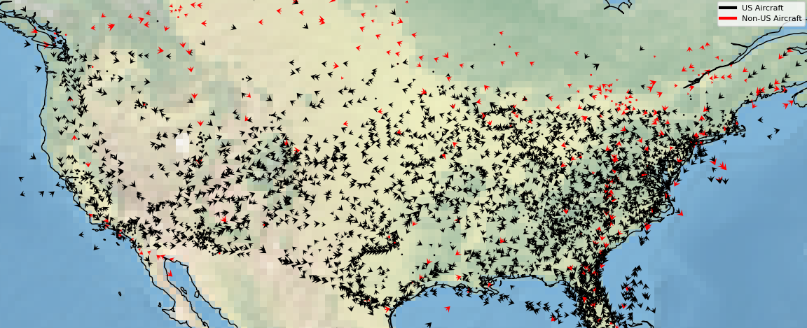
In the quiver example below, we see the direction and speed (relative to it’s arrow size) of each individual aircraft. When this data is animated, we can see the arrows get smaller for aircraft on the approach, and grow as they are taking off. It has a very interesting appearance.
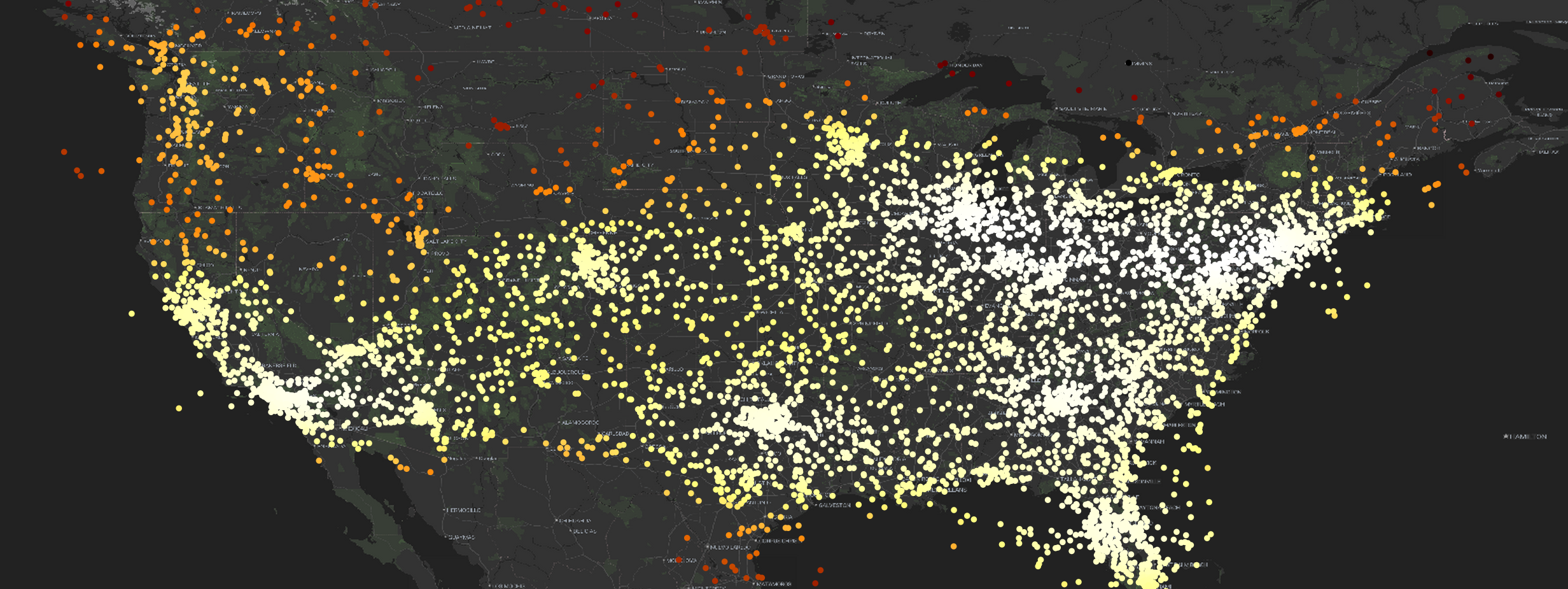
We also can map this out is by creating a scatter distribution and embed the Gaussian KDE (Kernel Density Estimation) mapping onto the individual points themselves to get a feel for the distribution as there is a lot of overlap at this scale:
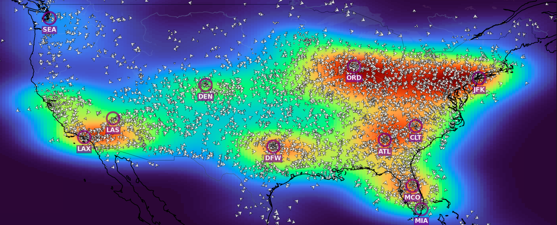
And we can map the KDE over the entire map itself, however, we must create a “meshgrid” over the plot. The aircraft exist between the grids native resolution, therefore we would need to re-shape the data into a 2-dimensional array containing the aircraft density distribution.
We can combine the 2D KDE mapping with the quiver plot to reveal a bit more information on aircraft density distribution, like so:
The plotting process is iterated over the folder of timestamped csv’s to generate the incremental aircraft movements over time.
Map Data Struggles
Something that left me completely stumped for a while is that I was not able to directly use the Stadia Maps API within in Cartopy 0.22.0 which was confusing and frustrating.
I chose to use the Stadia Maps API via the Cartopy as it had already build the classes to plug into the API and it had a high contrast map tile that thought was suitable. But it doesn’t work on Cartopy 0.22.0… It really was a head scratcher for me. After reading the site-packages I realised that the API class I was using was completely defunct within a matter of months.
Although, I discovered a revised class object sitting (which works) in Cartopy 0.23.0 which was unavailable as a wheel/conda package. So, this was the first time I had to go build the package from source in the git repo just for this specific use case. But when they eventually package the final version of 0.23.0 in conda, this issue will no longer be the case…
Although I came across some issues since each API call for the mapping data costs credits to use. And since the map is completely static, it doesn’t make sense to make multiple API calls for each set of data from a cost perspective.
Even from a time perspective, it takes a very long time to render the map, about 13s for each snapshot which is way too long. Instead, the process I have created is to only clear the relevant “artists” on the matplotlib figure whilst retaining the map image on the plot. So we can save a lot of time.
Plotting the scatterpoints takes a trivial amount of time in comparison, about 1-2s or so per iteration.
Slow Color Mesh Plotting
Plotting the 2D Gaussian KDE plot was much more intensive as we are drawing a high resolution color mapping across the entire grid. Each iteration was about 20-25s to render but it tended to slow down to over 1m per iteration. The filled color grid mapping took about 20 hours to create all 850 images. Probably because I was not removing the artist itself per iteration, but this is just a working assumption. I’ll have a look at optimising in the future.
Bearing in mind we are purely talking about single core processing. Splitting the load across the rest of the CPU cores, and spawning the data processes in parallel would’ve cut the time significantly. I’ll investigate this setup in the near future to optimise the compute power since Python is pretty slow in general.
✈️ Data Animation
This is the key component where we can physically see how the aircraft are moving over time.
This animation procedure is fairly straightforward when using ffmpeg in a bash script. We can point to a folder with a collection of images and ask the program to splice them together into a mp4 file (or whatever file type).
Assuming the images are timestamped, the files should be sorted in chronological order so you don’t need to fiddle with passing additional sort arguments into your command.
It only takes a few minutes on my machine to splice together 850 images together.
My file structure is segmented into multiple folders partitioned by “date” and “visualisation type”, I simply pass those parameters into my bash script to generate the spliced video.
The script is only a few lines and looks like this:
#!/bin/sh
# $1 Specifies the Date of the folder to be accessed - E.g. '2024-08-24'
# $2 Specifies the Image Folder To Be Accessed - E.g. 'scatter' or 'quiver' or 'contourf'
# Example of how to run bash script: $(./mkvideo '2024-08-24' 'scatter')

base_folder="$(dirname $(pwd))"
output="$base_folder/animate/videos"
image_data="$base_folder/data/get_states/$1/$2/crop"

ffmpeg -framerate 24 -pattern_type glob -i "${image_data}/*.png" $output/$1_$2_movements.mp4
Other video processing was down on Kdenlive to add in the musical audio transitions.
📽️ Data Time-lapse
Videos illustrating the 16-hour scatter plot time-lapse of aircraft flying over North America.